
Creating D365FO Telemetry Data Visualizations in Power BI
 Alex Meyer
In the 10.0.30 release of D365FO, which became generally available on Oct 21st, 2022, Microsoft added the ability for customers to report on the telemetry data of their end users. I wanted to take a quick overview of this feature and look at opportunities to use this data.
Prerequisites
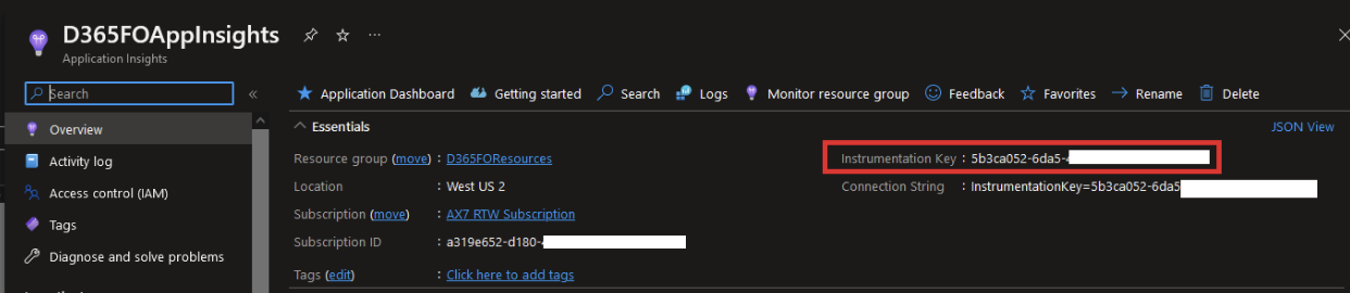
The telemetry data from Microsoft is stored in Azure Application Insights, so we must create a resource for us to store this data. Once created please note the Instrumentation Key as we will need that in subsequent steps.
View fullsize
How to Enable Telemetry
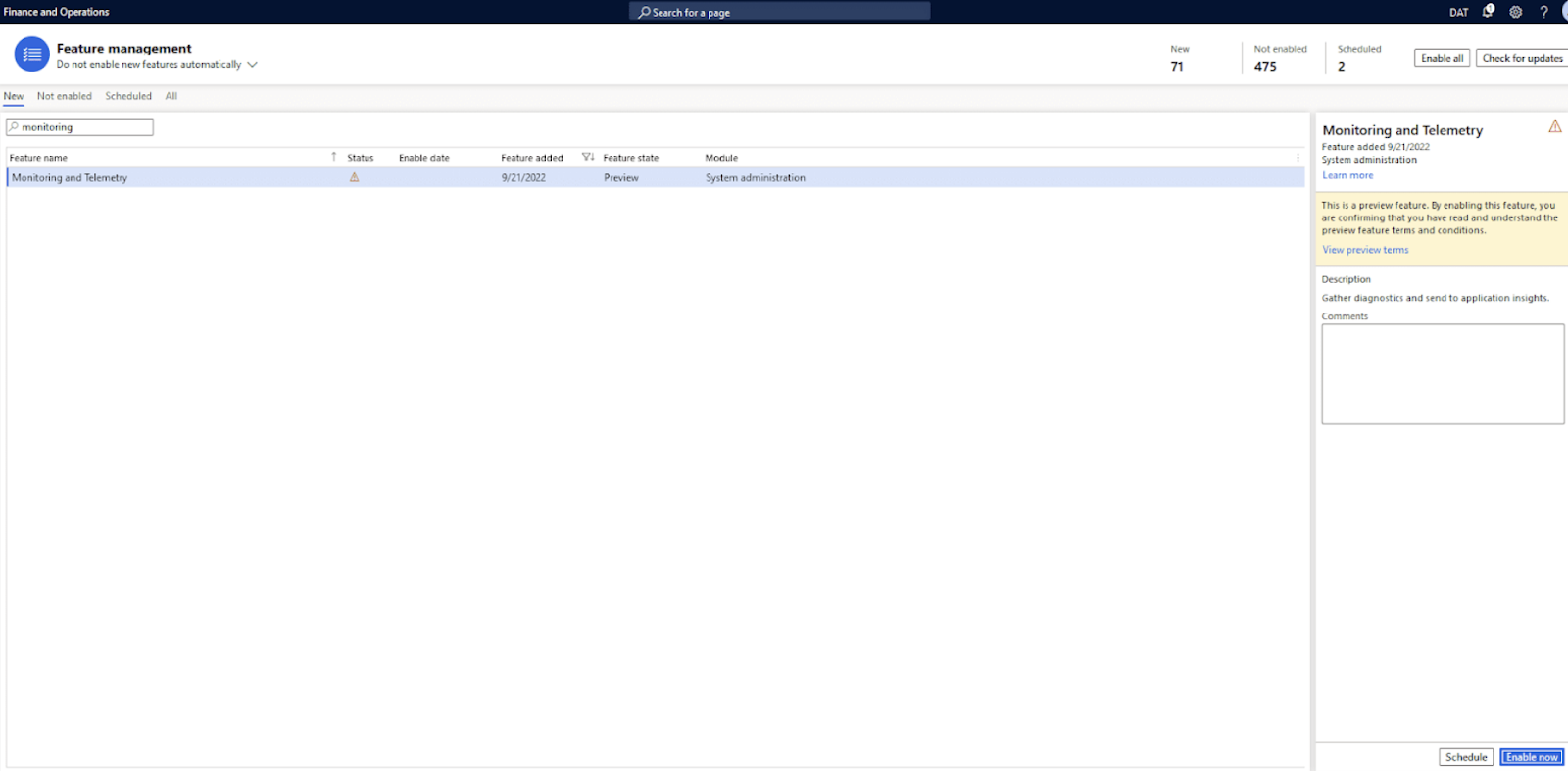
The telemetry feature is labeled as a ‘preview feature’ so it is not enabled by default. That means we need to enable the feature by navigating to System Administration -> Workspaces -> Feature.
Management and search for ‘monitoring and telemetry’. You can see the Status below is marked as the yellow triangle with an exclamation point, indicating it is not enabled.
View fullsize
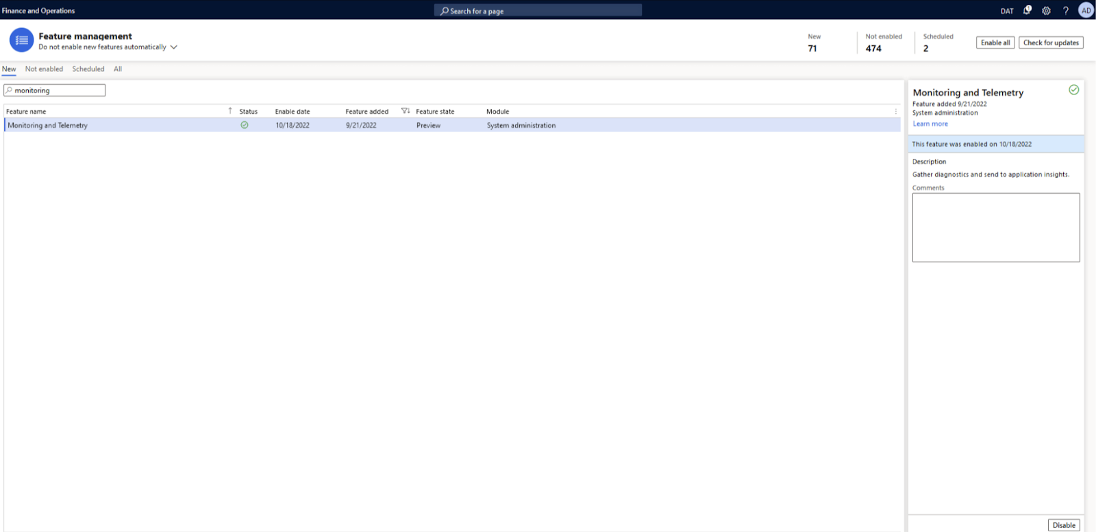
After enabling the feature, you can see the Status change to the green check mark.
View fullsize
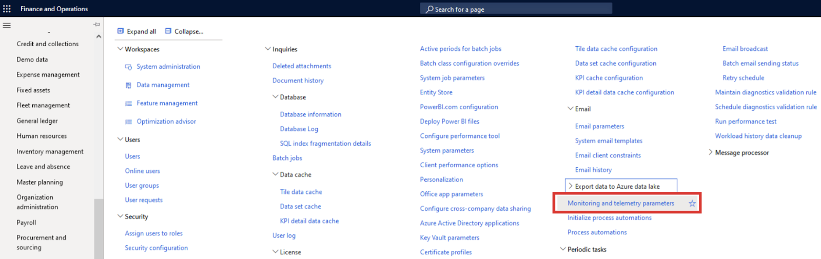
Now we can navigate to System Administration -> Setup -> Monitoring and Telemetry Parameters.
View fullsize
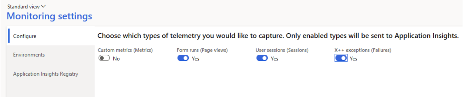
We can now configure which events we want to enable in the Configure tab, specifically for our case we want to enable the Form Runs, User Sessions, and X++ exceptions:
View fullsize
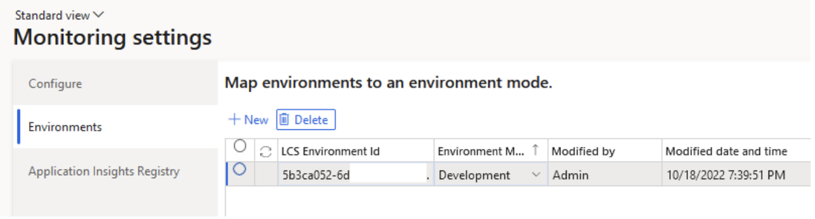
In the Environments tab, the LCS Environment variable is the Instrumentation Key from your Application Insights resource from the previous step. The Environment Mode should be set to whatever environment you want you are connecting to.
View fullsize
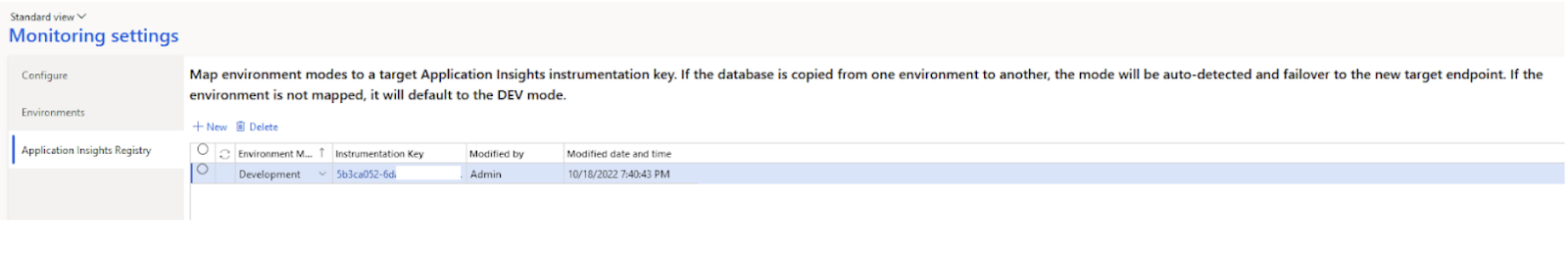
In the Application Insights Registry tab, we again will input our Environment Mode and Instrumentation key values.
View fullsize
Once these values are set, the configuration portion for telemetry data is complete.
Reporting on Telemetry Data
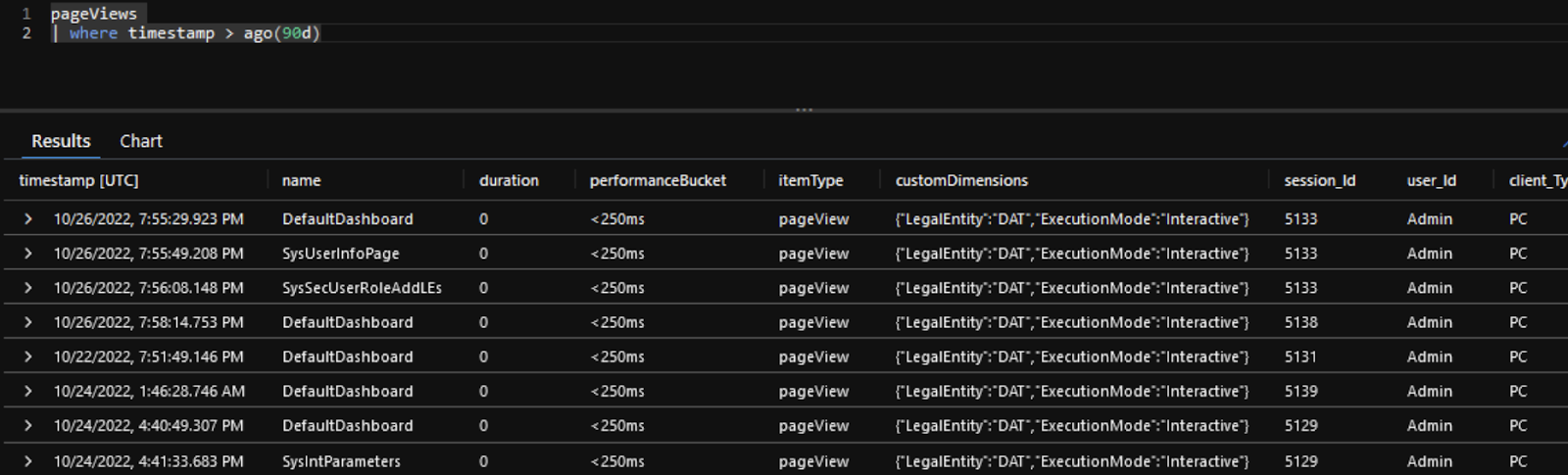
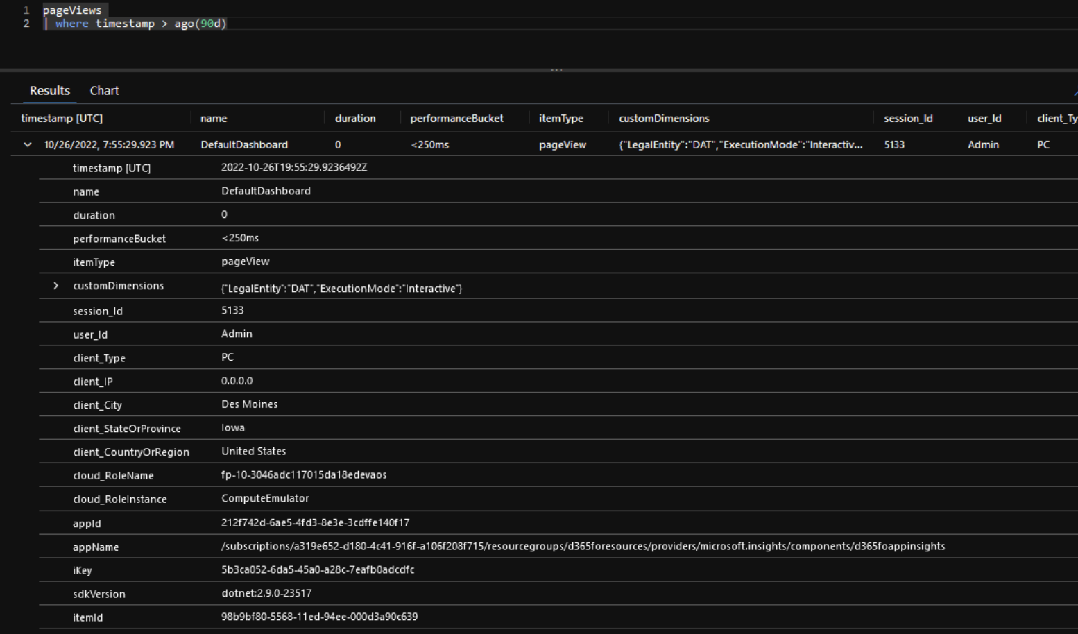
In the Application Insights resource, we created initially within Azure, we can navigate to the Monitoring -> Logs area and see the tables available for us to query. The data in Application Insights can be queried using the Kusto Query Language (KQL). For example, in the screenshot below we can see we can query the ‘pageviews’ table to see all page views from users within the last 90 days.
View fullsize
If we take a deeper dive into the data itself we can see we are able to obtain the following from the user interaction:
- Timestamp
- Menu item display name
- UserId
- LegalEntityId (embedded in the customDimensions field)
- City, State, Country of origin
- D365FO environment (cloud_RoleName field)
Note: Some fields do not appear to be populating at this time (duration, client_IP, etc)
View fullsize
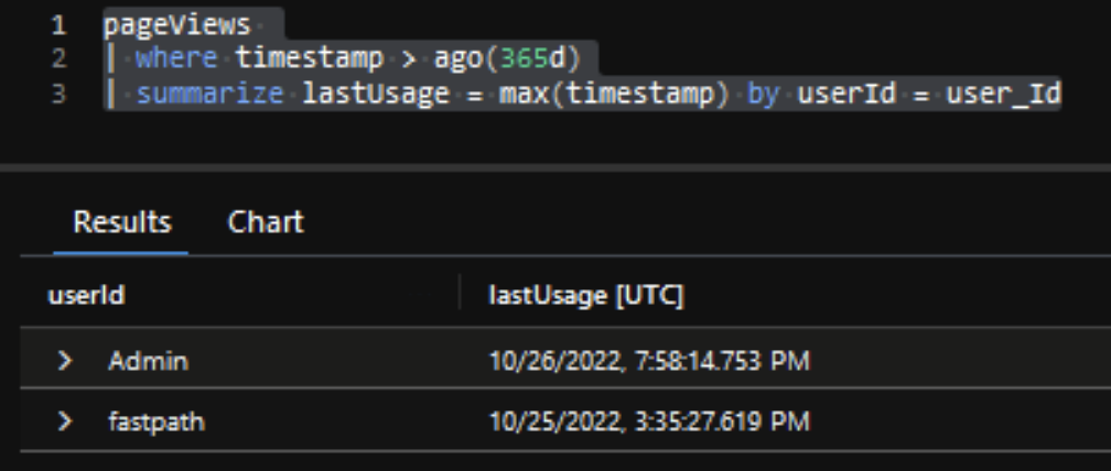
Using the KQL language we can perform business logic on the data, for example, you could use the following query to show the last time a user interacted with D365FO:
View fullsize
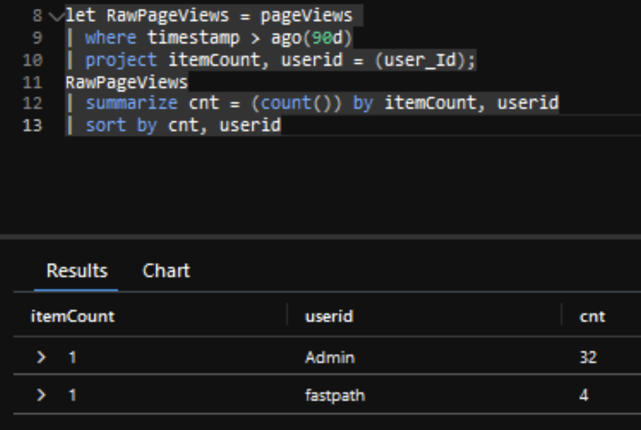
Another example would be wanting to see how many menu items a user navigated to over a period of time:
View fullsize
Reporting From Power BI
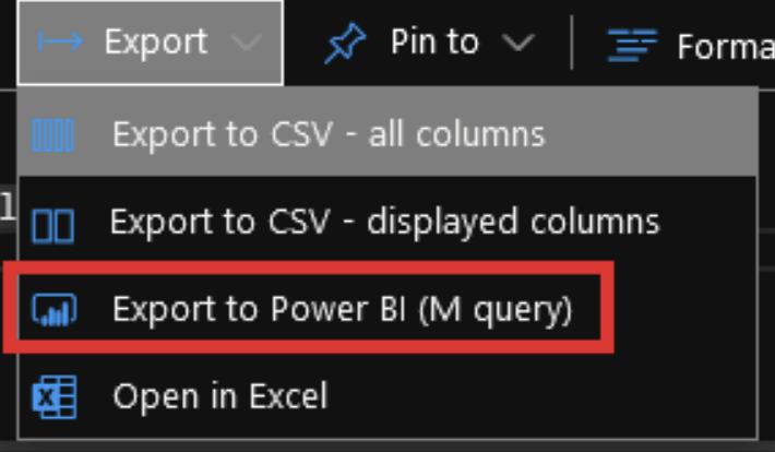
This data can also be exported to Power BI for additional analysis and visualizations. Within Application Insights we can select Export -> Export to Power BI:
View fullsize
If we choose that option it exports a text file with the following instructions commented out at the top.
View fullsize
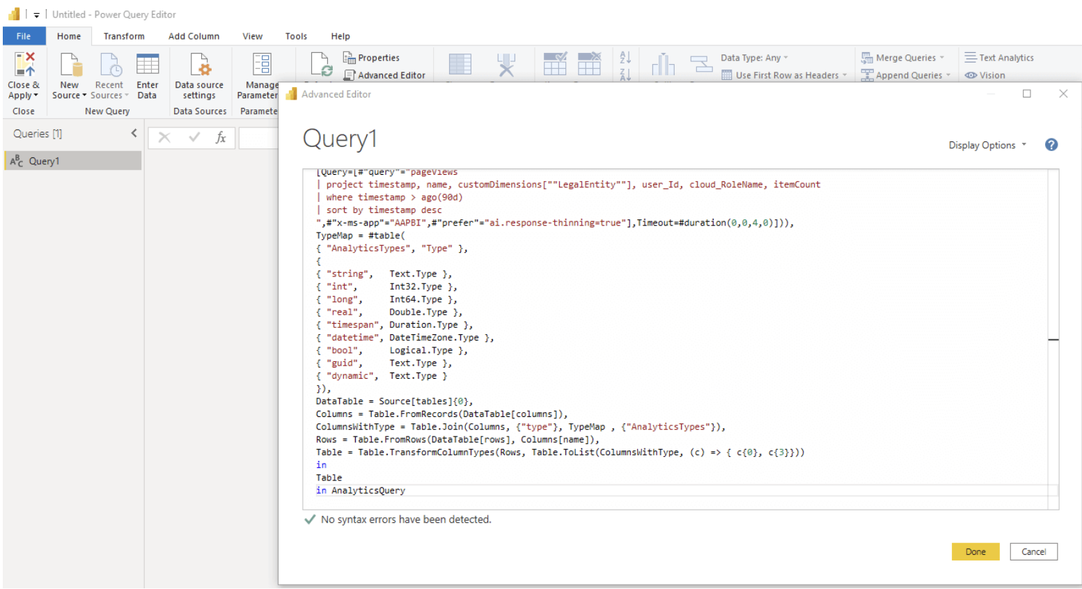
Follow the steps and copy the entire contents into an ‘Advanced Editor’ in PowerBI.
View fullsize
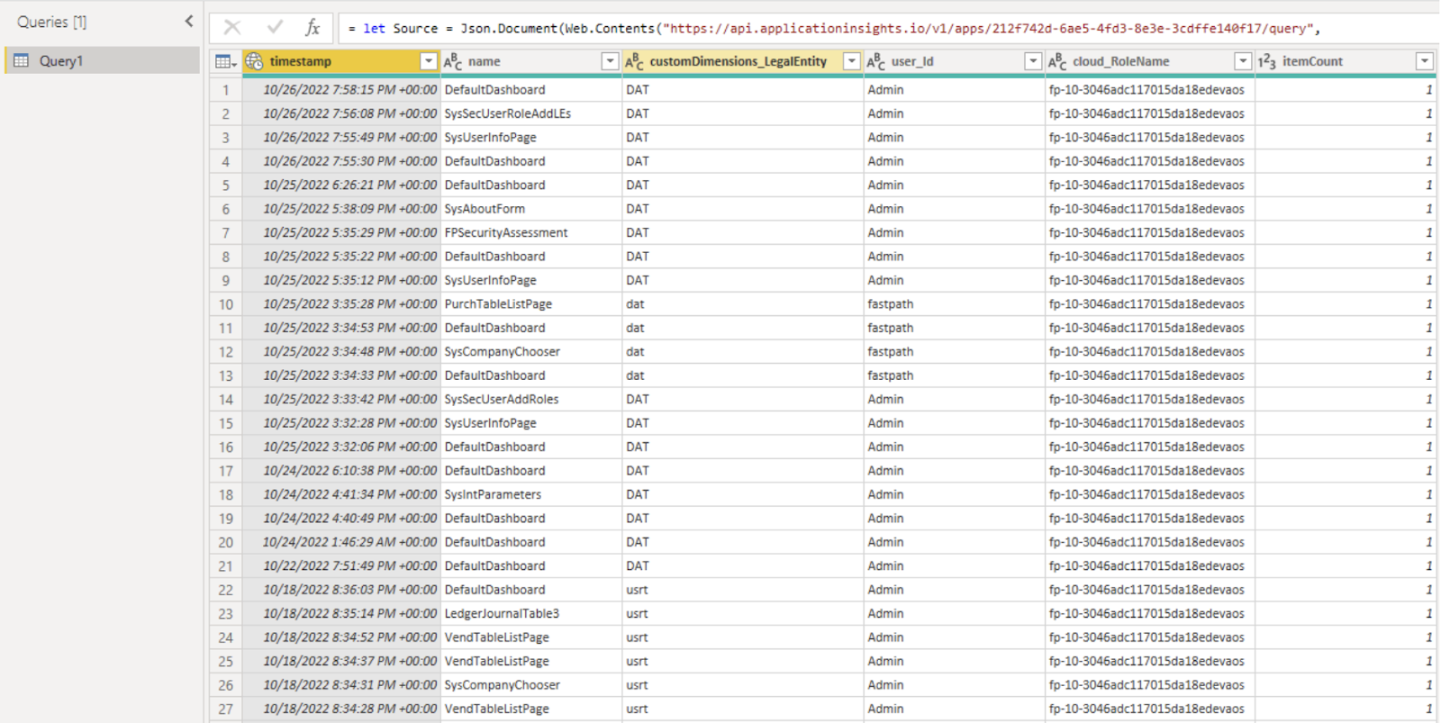
After authenticating, the PageViews table data is successfully pulled into PowerBI.
View fullsize
And we can create different PowerBI visualizations using this data.
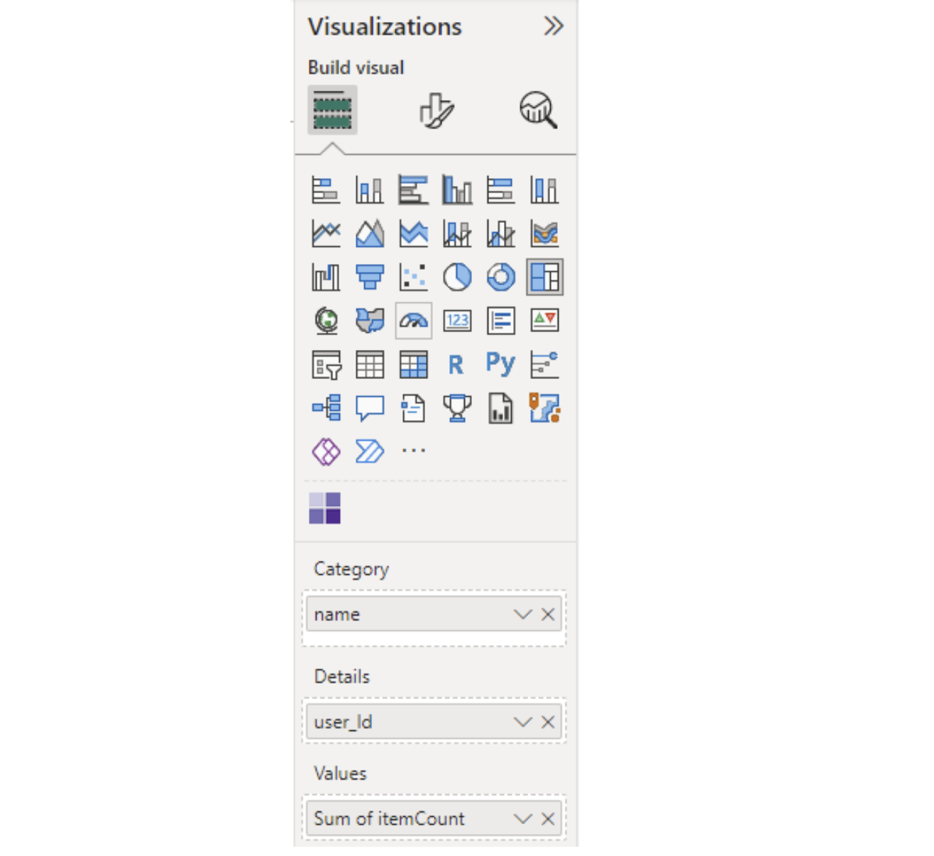
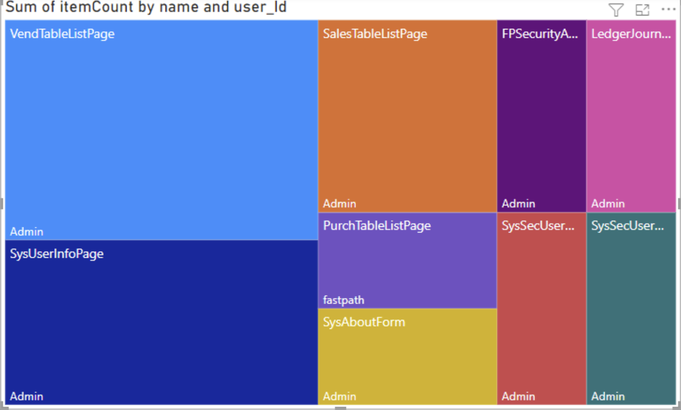
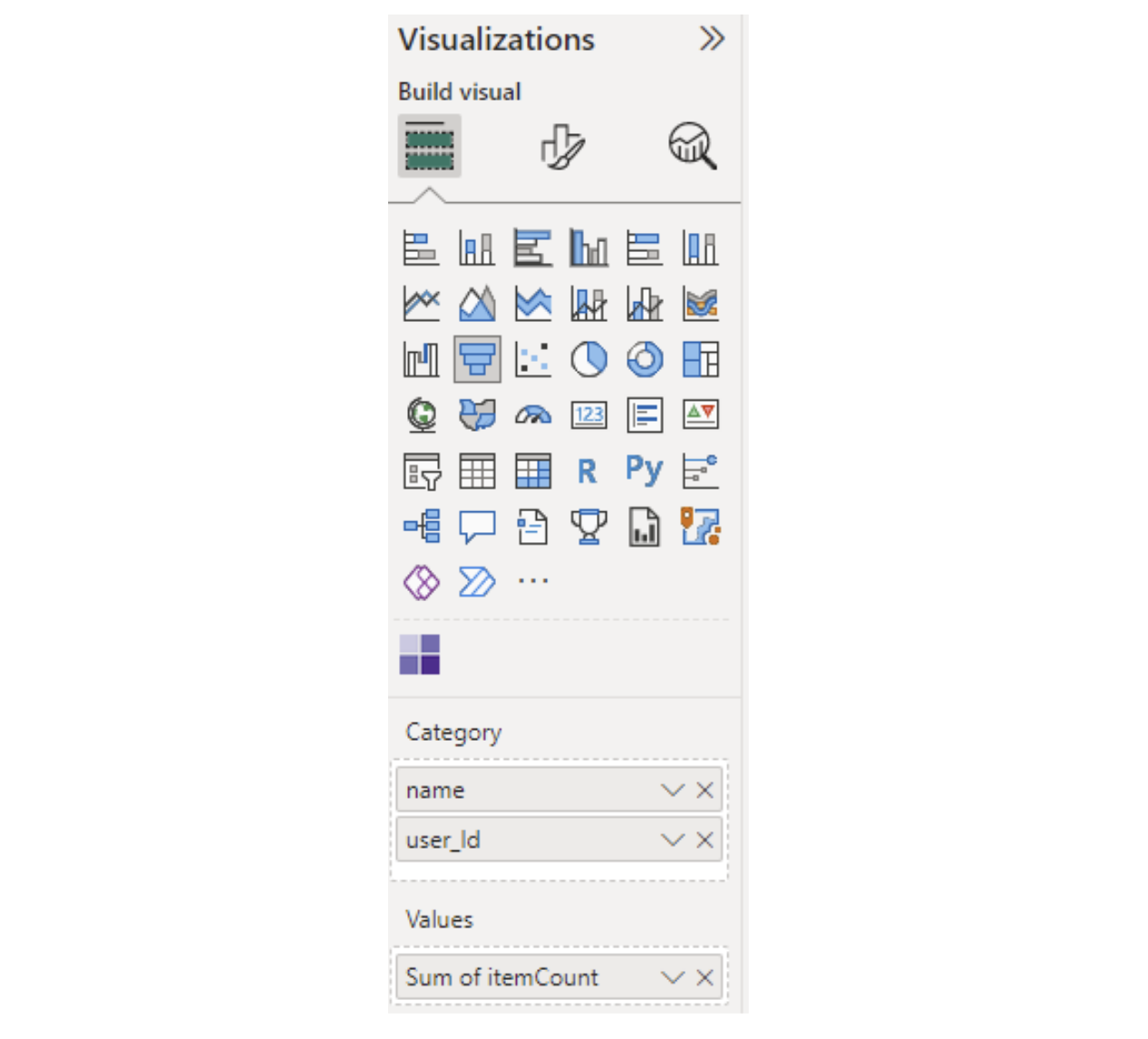
For example, we can create a Treemap of the data which will show the number of times each menu item was visited by each user and will show a colorized weighted view of this data. If we set it up with the following parameters:
View fullsize
It will generate this visualization output:
View fullsize
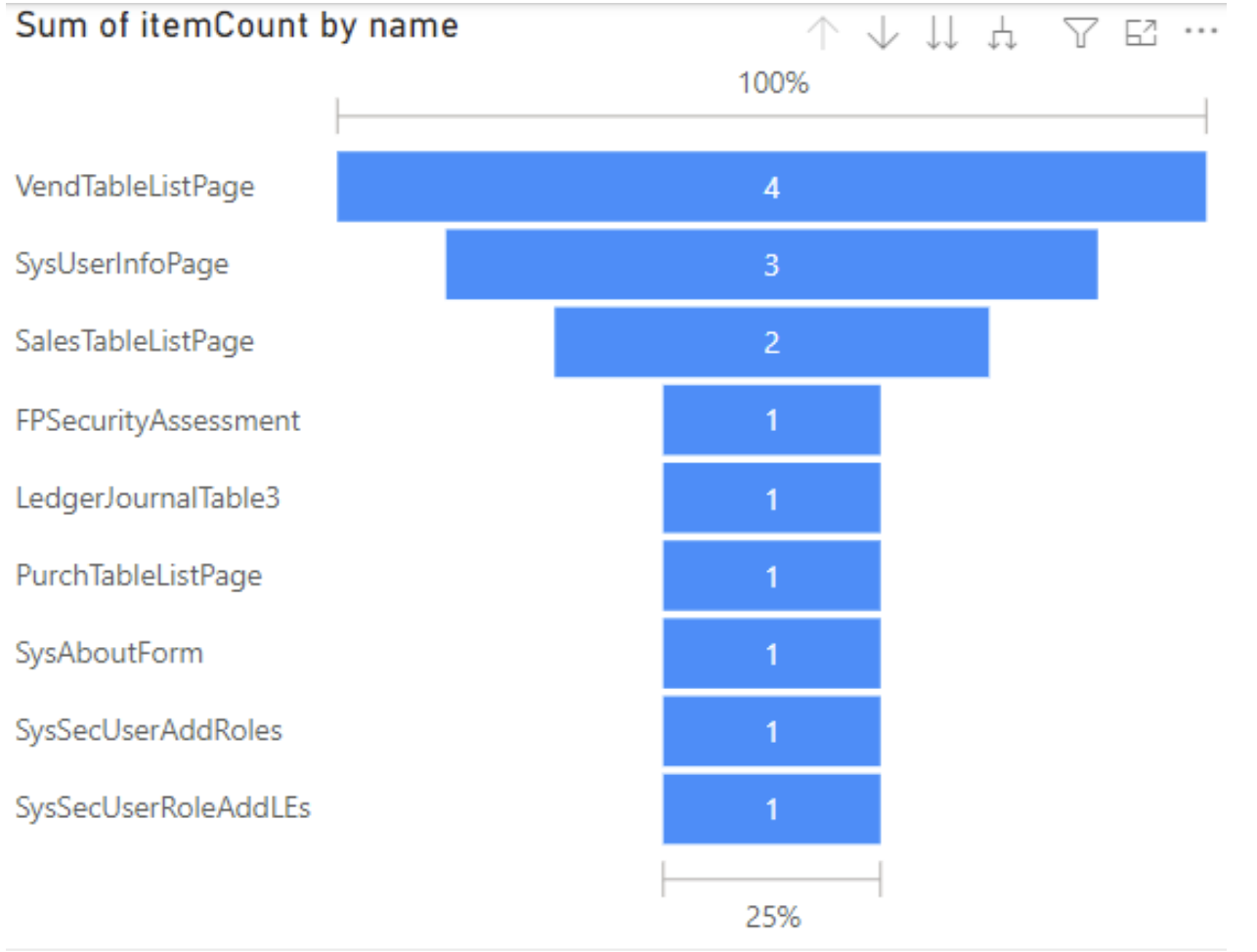
We could also use a Funnel visualization with the following parameters, which would show the number of times each menu item was visited:
View fullsize
And it would generate this visualization output:
View fullsize
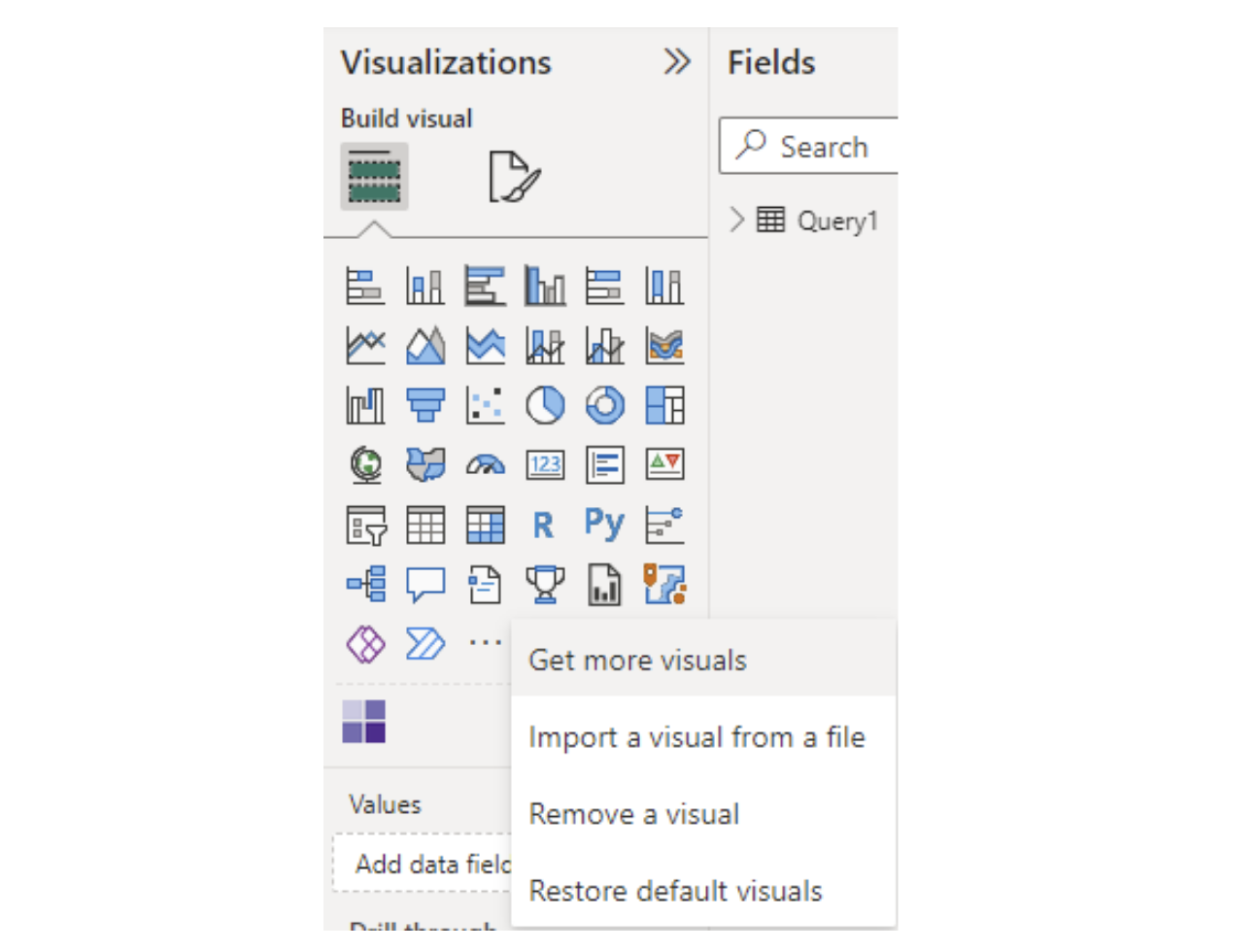
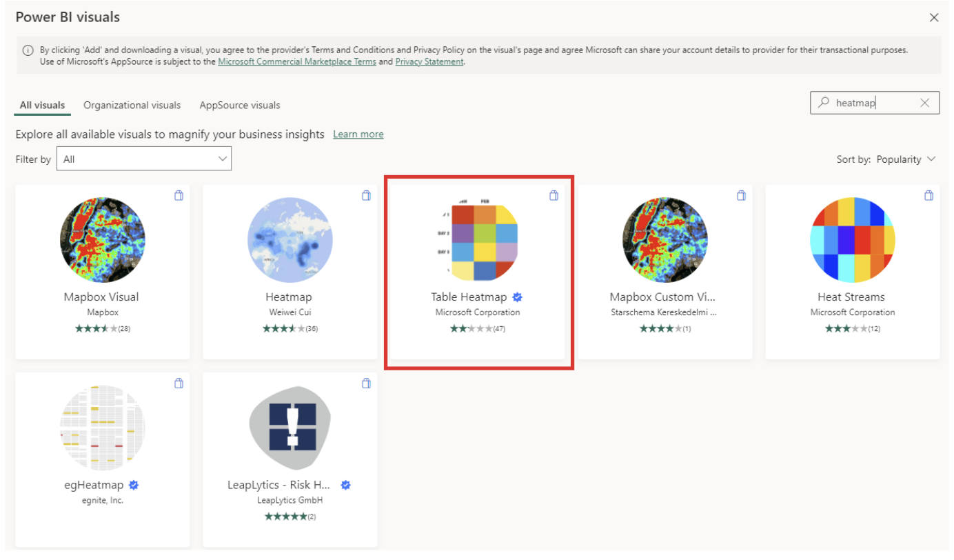
And finally, we could utilize a Heatmap visualization to show the same data in a slightly different way. The Heatmap visualization is not enabled by default, so you must click on the 3 dots at the bottom of the Visualization area and go to ‘Get more visuals’
View fullsize
Then search for ‘heatmap’, and select the visualization from Microsoft:
View fullsize
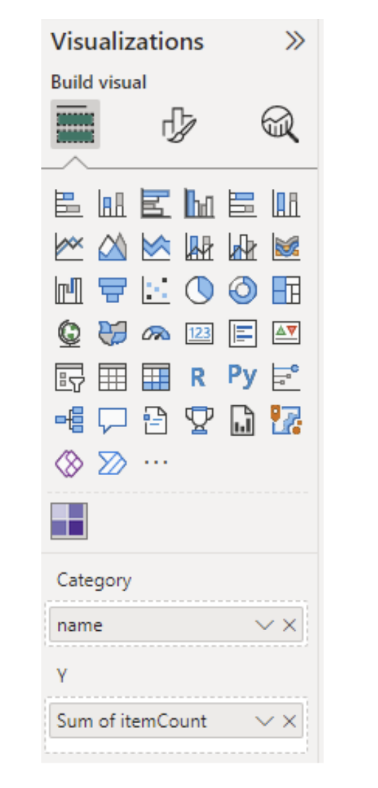
Once downloaded, you can set up the heatmap visualization with the following parameters:
View fullsize
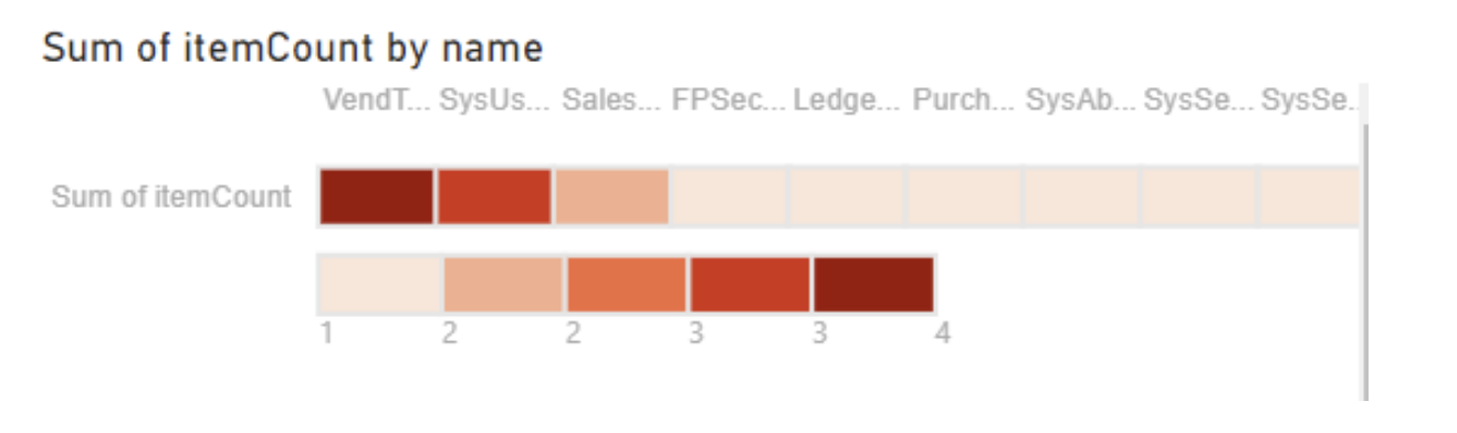
And it will generate the following visualization:
View fullsize
Conclusion
Hopefully, this overview helps to explain how to set up telemetry data from your D365FO instance in Azure AppInsights, how you can query that data, and how to create visualizations from that data for easier consumption and better understanding in Power BI.
Resources
